Empowering Education Through Digital Digital Experience
I approach web design with a user-first mindset, focusing on clarity, usability, and visual cohesion. Every design decision is grounded in how real people interact with digital experiences. My goal is to create intuitive interfaces that not only look beautiful but also function seamlessly across devices and platforms.
During my time working in-house with Project Lead The Way, a non-profit organization committed to advancing STEM education, my web designs were frequently adopted as the new benchmark for the company’s digital presence. Several of my projects became internal templates for a refreshed visual direction, helping to define a more modern, cohesive web identity. This work reflects my ability to translate brand goals into compelling digital experiences that resonate with users and stakeholders alike.
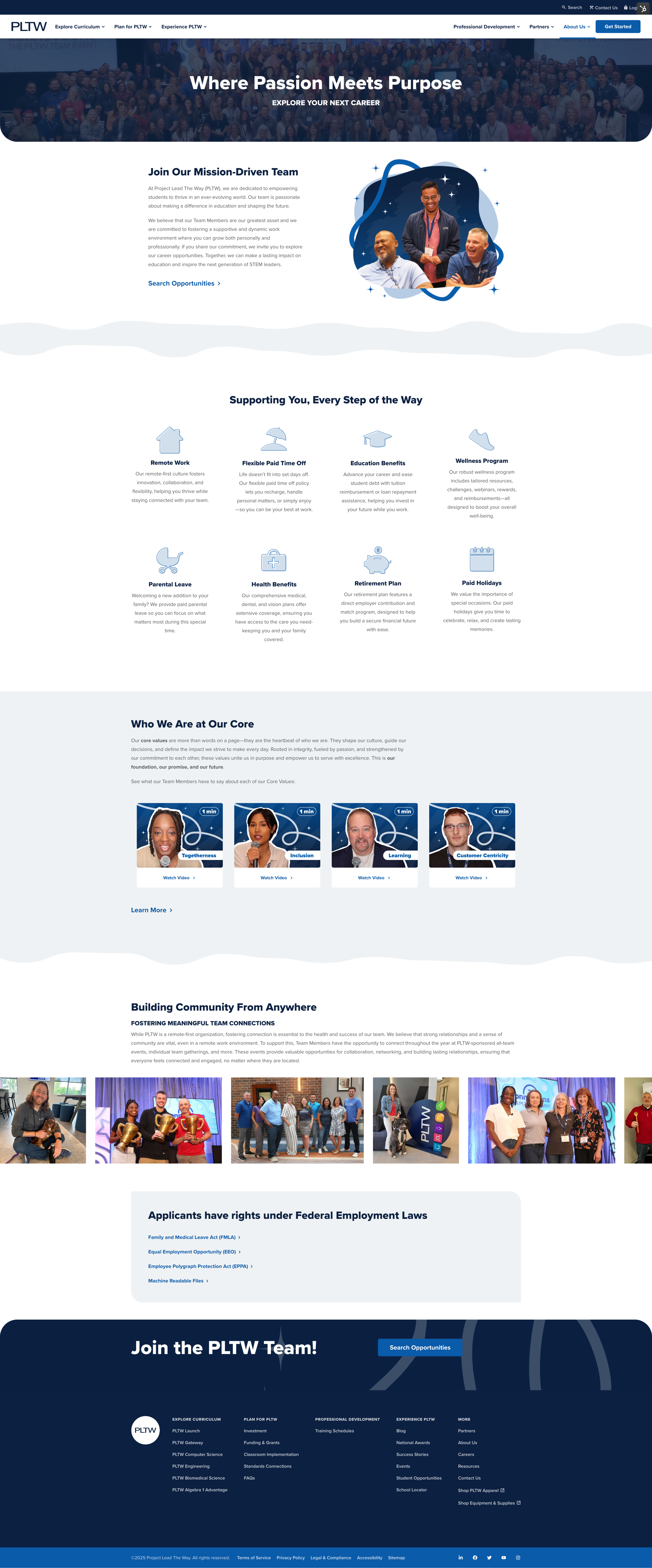
The PLTW Careers page received a full redesign to create a more consistent, engaging experience for prospective employees. As one of the site’s most visited pages, the refresh focused on clear structure, branded visuals, and user-friendly features that better reflect the organization's culture and opportunities.
Custom imagery was created to highlight happy employees in a way that felt playful, dynamic, and on-brand. Rather than relying on standard image layouts, I layered each photo with brand-inspired elements like lines, stars, and sketch-style accents to add movement and personality. This approach brought energy to the visuals while reinforcing the company’s identity in a more human and engaging way.
Custom two-tone icons were designed to complement the website’s modern, refreshed aesthetic. Each icon was simplified for clarity and created in a cohesive style that aligned with the overall visual language of the page.
Video thumbnails were designed using a consistent format, featuring different employees to maintain visual variety while reinforcing brand cohesion. This approach provided a clean, organized way to showcase videos without embedding them directly. Each thumbnail also included the video’s watch time, helping users quickly gauge their interest and time commitment before launching the content in a pop-up viewer.
A scrolling banner was also introduced to add movement and visual interest, offering a user-friendly way to display multiple images within a compact space. This interactive element helps keep users engaged while allowing for more content to be showcased without overwhelming the layout.
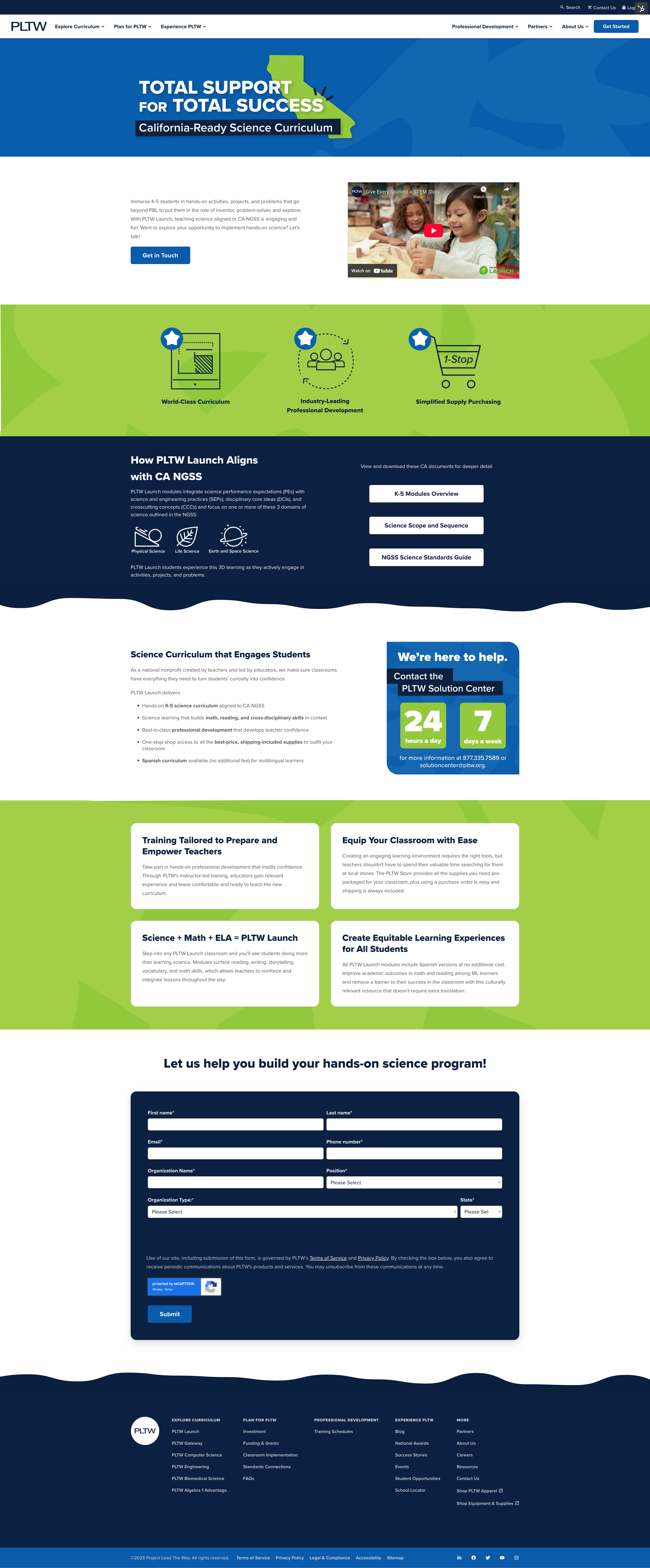
The PLTW California-Ready Science Curriculum page was designed as a digital companion to a coordinated print ad campaign, featuring a distinct sub-brand colorway tailored to a specific product. While it reflects PLTW’s updated look and feel, the design introduces subtle visual differences to differentiate the initiative. The layout was carefully structured to present dense content in a clear, user-friendly format, making key information easily accessible and engaging for a targeted audience.